| CustomClass | STRING | <> | | Enables you to define an HTML class to the top div of the widget. Multiple classes can be separated by a space. |
| HTMLText | STRING | <> | | It outputs the content of the widget as HTML |
| MarkdownText | STRING | <> | | It outputs the content of the widget as Markdown |
| DebounceTime1 | INTEGER | | 300 | Time in milliseconds from last key pressed to triggering the ContentChanged event. |
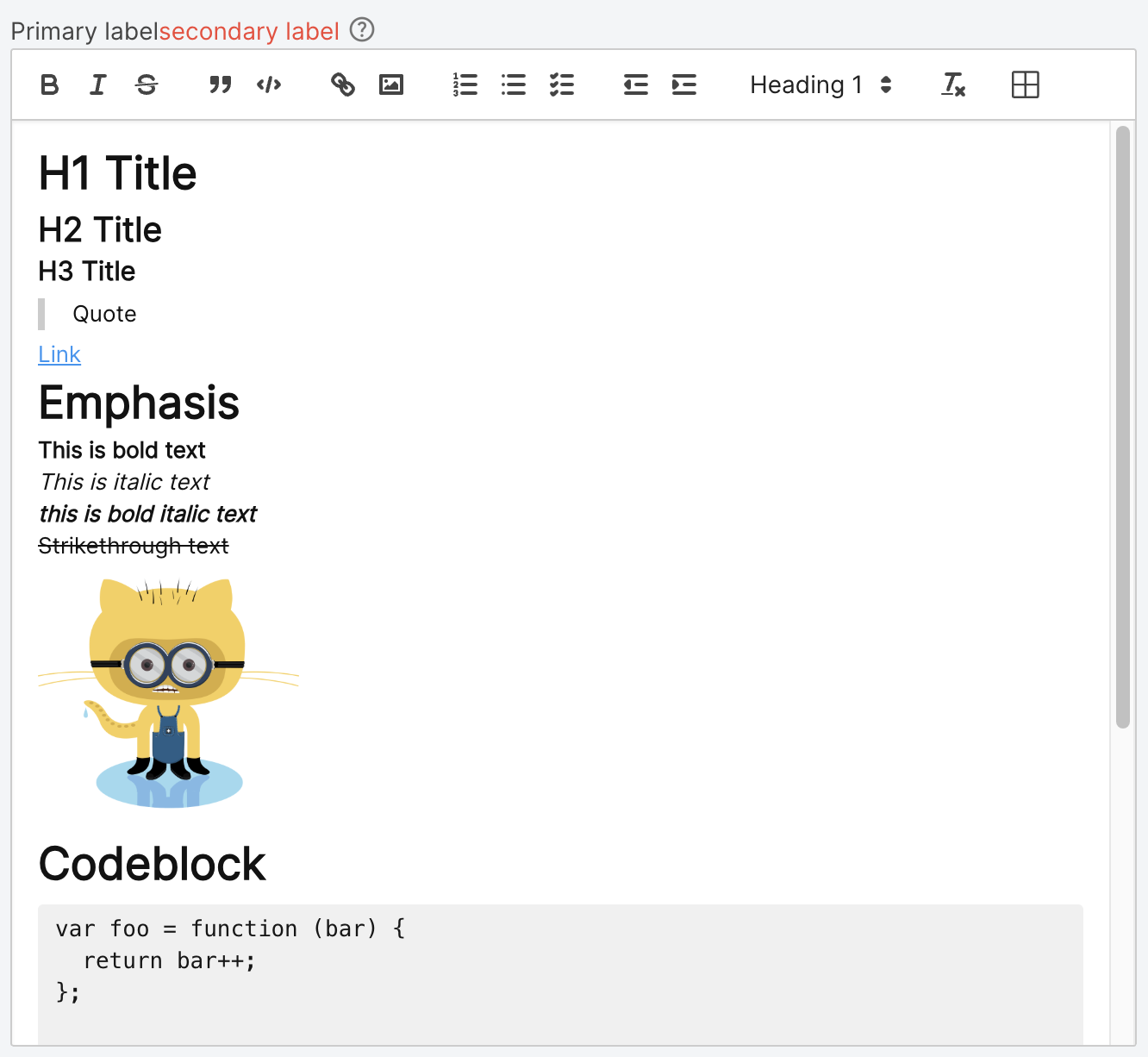
| Label | STRING(localized) | < | | The text that is displayed above the Rich Text Editor |
| ShowSecondaryLabel | BOOLEAN | < | | Flag property which decides whether or not to show the Secondary Label. |
| SecondaryLabel | STRING(localized) | < | | Type of the input that will be passed to the widget. |
| ShowHelpIcon | BOOLEAN | < | FALSE | Will enable a customizable icon on the right of the label, the icon will show the tooltip on hover for more documentation |
| HelpIcon | STRING | < | material-outlined:help | Icon to be displayed on the right of the label when ShowHelpIcon is enabled. |
| Tooltip | STRING(localized) | < | | Optional tooltip used to display additional information. If ShowHelpIcon is enabled, the tooltip will be triggered by hovering the HelpIcon. This tooltip can be styled globally from GlobalStyles. |
| TooltipFormat | STRING(localized) | < | | see Format Complex |
| Mentions | INFOTABLE | < | | The list of mentions that will be available in the editor. |
| MentionsDenotationChars | STRING | | | Specifies which characters will cause the mention autocomplete to open. Must be a single character. An empty string will disable the mention feature(ex @). |
| MentionDenotationCharFieldName | LIST | | | The column from the Mentions with the character that will be used to denote the mention. Leaving it empty means that the mention will trigger for all characters. |
| MentionDisplayFieldName | LIST | | | The column from the Mentions with the display of the object. |
| MentionIdFieldName | LIST | | | The column from the Mentions with the id of the object. |
| Placeholder | STRING(localized) | < | | Text that appears in the text box when it has no value set. |
| ReadOnly | BOOLEAN | < | FALSE | Disables any interaction with the widget. |
| TabSequence | INTEGER | | 0 | Specifies the tab order of an element (when the "tab" button is used for navigating). |
| Template | LIST | < | | The widget template to use for this widget. |
| ToolbarBehavior | LIST | | | How the toolbar should behave. Either Fixed, Floating or Hidden. |
| ToolbarOptions | LIST | | | The options that are available in the toolbar. For example, if just markup is needed, you can set this to "Basic". Available options: Full, Basic, Minimal, Custom. |
| ToolbarControls | JSON | < | | A JSON that defines which toolbar controls to display and how. Available only when ToolbarOptions is set to Custom. See more options: https://quilljs.com/docs/modules/toolbar#container |